4 Data visualization basics with ggplot2
R includes extremely powerful utilities for data visualization, but most modern applications make use of the tidyverse package ggplot2.
A quick word about base R plotting–I don’t mean to declare that you can’t use base R plotting for your projects at all, and I have published several papers using base R plots. Particularly as you are using R for your own data exploration (not meant for sharing outside your team, say), base utilities like plot() will be very useful for quick insight.
ggplot2 provides a standardized, programmatic interface for data visualization, in contrast to the piecemeal approach common to base R graphics plotting. This means that, while the syntax itself can be challenging to learn, syntax for different tasks differs in logical and predictable ways and, together with other tidyverse principles (like select() and filter() approaches), ggplot2 makes it easy to make publication-quality visualizations with relative ease.
In general, ggplot2 works best with data in “long” or “tidy” format, such as that resulting from the output of pivot_longer(). The
The schematic elements of a ggplot are as follows:
# The ggplot() function creates your plotting environment.  We usually save it to a variable in R so that we can use the plug-n-play functionality of ggplot without retyping a bunch of nonsense
p <- ggplot(mapping = aes(x = <a variable>, y = <another variable>, ...),
            data = <your data>)

# Then, you can add various ways of plotting data to make different visualizations.
p +
  geom_<your chosen way of plotting>(...) +
  theme_<your chosen theme> +
  ...
In graphical form, the following diagram (from VT Professor JP Gannon) gives an intuition of what is happening:
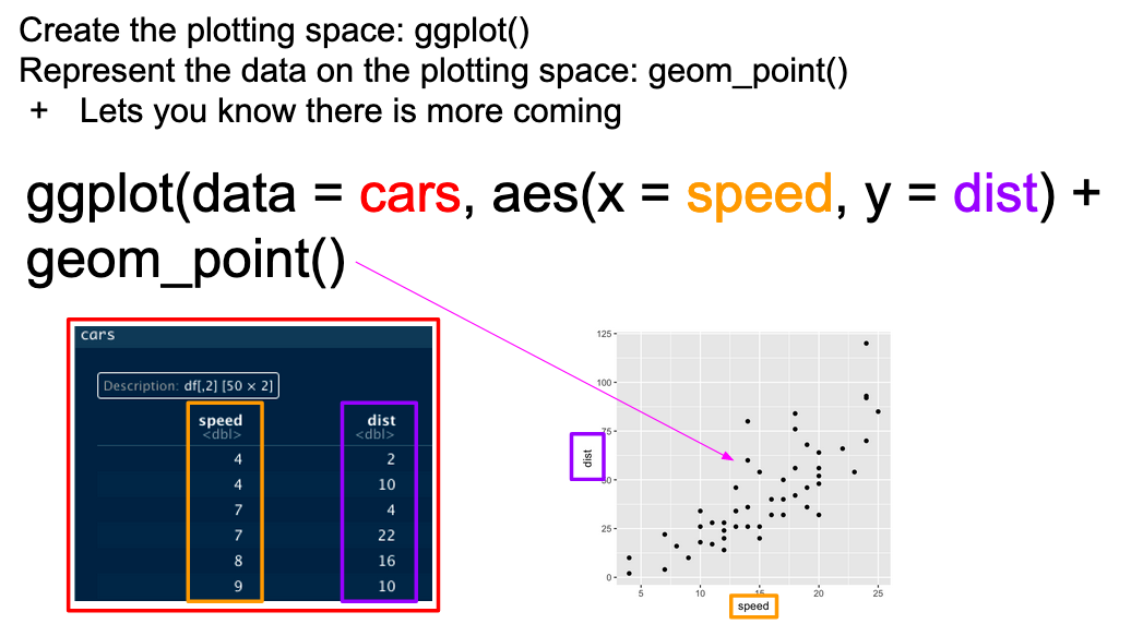
Basic ggplot mappings. Color boxes indicate where the elements go in the function and in the plot.
4.1 Your first ggplot()
Our beer data is already relatively tidy, so we will begin by making an example ggplot() to demonstrate how it works.
beer_data %>%
  ggplot(mapping = aes(x = rating, y = overall)) + # Here we set up the base plot
  geom_point()                           # Here we tell our base plot to add points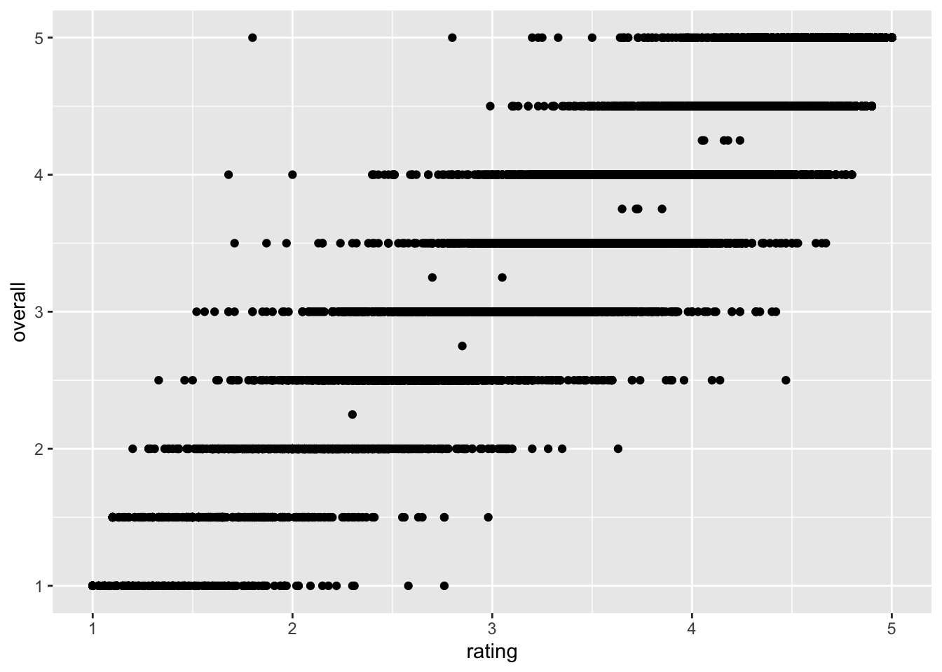
This doesn’t look all that impressive–partly because the data being plotted itself isn’t that sensible, and partly because we haven’t made many changes. But before we start looking into that, let’s break down the parts of this command.
4.2 The aes() function and mapping = argument
The ggplot() function takes two arguments that are essential, as well as some others you’ll rarely use. The first, data =, is straightforward, and you’ll usually be passing data to the function at the end of some pipeline using %>%
The second, mapping =, is less clear. This argument requires the aes() function, which can be read as the “aesthetic” function. The way that this function works is quite complex, and really not worth digging into here, but I understand it in my head as telling ggplot() what part of my data is going to connect to what part of the plot. So, if we write aes(x = rating), we can read this in our heads as “the values of x will be mapped from the ‘rating’ column”.
This sentence tells us the other important thing about ggplot() and the aes() mappings: mapped variables each have to be in their own column. This is another reason that ggplot() requires tidy data.
4.3 Adding layers with geom_*() functions
In the above example, we added (literally, using +) a function called geom_point() to the base ggplot() call. This is functionally a “layer” of our plot, that tells ggplot2 how to actually visualize the elements specified in the aes() function–in the case of geom_point(), we create a point for each row’s combination of x = rating and y = overall.
beer_data %>%
  select(rating, overall)
## # A tibble: 20,359 × 2
## rating overall
## <dbl> <dbl>
## 1 4.46 5
## 2 3.74 4
## 3 3.26 3
## 4 3.5 3.5
## 5 3.86 3.5
## 6 3.11 3.5
## 7 3.55 3.5
## 8 3.06 3
## 9 4 4
## 10 3.21 3.5
## # … with 20,349 more rows
## # ℹ Use `print(n = ...)` to see more rowsThere are many geom_*() functions in ggplot2, and many others defined in other accessory packages. These are the heart of visualizations. We can swap them out to get different results:
beer_data %>%
  ggplot(mapping = aes(x = rating, y = overall)) +
  geom_smooth()
## `geom_smooth()` using method = 'gam' and formula 'y ~ s(x, bs = "cs")'%20switches%20the%20way%20the%20data%20map-1.png) Here we fit a smoothed line to our data using the default methods in
Here we fit a smoothed line to our data using the default methods in geom_smooth() (which in this case heuristically defaults to a General Additive Model).
We can also combine layers, as the term implies:
beer_data %>%
  ggplot(mapping = aes(x = rating, y = overall)) +
  geom_jitter() + # add some random noise to show overlapping points
  geom_smooth()
## `geom_smooth()` using method = 'gam' and formula 'y ~ s(x, bs = "cs")'s%20are%20layers%20in%20a%20plot-1.png)
Note that we don’t need to tell either geom_smooth() or geom_jitter() what x and y are–they “inherit” them from the ggplot() function to which they are added (+), which defines the plot itself.
What other arguments can be set to aesthetics? Well, we can set other visual properties like color, size, transparency (called “alpha”), and so on. For example, let’s try to look at whether there is a relationship between ABV and perceived quality.
beer_data %>%
  # mutate a new variable for plotting
  mutate(high_abv = ifelse(abv > 9, "yes", "no")) %>%
  drop_na(high_abv) %>%
  ggplot(mapping = aes(x = rating, y = overall, color = high_abv)) +
  geom_jitter(alpha = 1/4) +
  scale_color_viridis_d() +
  theme_bw()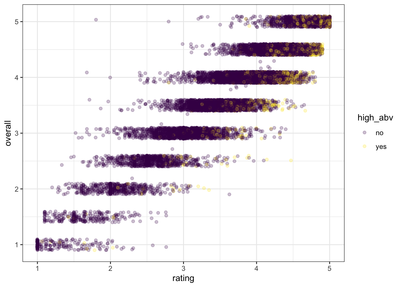
We can see that most of the yellow “yes” dots are in the top right of the figure–people rate more alcoholic beer as higher quality for both overall and rating.
4.4 Arguments inside and outside of aes()
In the last plot, we saw an example in the geom_jitter(alpha = 1/4) function of setting the alpha (transparency) aesthetic element directly, without using aes() to map a variable to this aesthetic. That is why this is not wrapped in the aes() function. In ggplot2, this is how we set aesthetics to fixed values. Alternatively, we could have mapped this to a variable, just like color:
beer_data %>%
  drop_na(abv) %>%
  ggplot(aes(x = rating, y = overall)) +
  # We can set new aes() mappings in individual layers, as well as the plot itself
  geom_jitter(aes(alpha = abv)) +
theme_bw()%20function-1.png)
As an aside, we can see the same relationship noted above: higher ABV is associated with higher ratings.
4.4.1 Using theme_*() to change visual options quickly
In the last several plots, notice that we have changed from the default (and to my mind unattractive) grey background of ggplot2 to a black and white theme. This is by adding a theme_bw() call to the list of commands. ggplot2 includes a number of default theme_*() functions, and you can get many more through other R packages. They can have subtle to dramatic effects:
beer_data %>%
  drop_na() %>%
  ggplot(aes(x = rating, y = overall)) +
  geom_jitter() +
theme_void()%20functions-1.png)
You can also edit every last element of the plot’s theme using the base theme() function, which is powerful but a little bit tricky to use.
4.4.2 Changing aesthetic elements with scale_*() functions
Finally, say we didn’t like the default color set for the points.
How can we manipulate the colors that are plotted? The way in which mapped, aesthetic variables are assigned to visual elements is controlled by the scale_*() functions. In my experience, the most frequently encountered scales are those for color: either scale_fill_*() for solid objects (like the bars in a histogram) or scale_color_*() for lines and points (like the outlines of the histogram bars).
Scale functions work by telling ggplot() how to map aesthetic variables to visual elements. You may have noticed that I added a scale_color_viridis_d() function to the end of the ABV plot. This function uses the viridis package, which has color-blind and (theoretically) print-safe color scales.
p <-
  beer_data %>%
  # This block gets us a subset of beer styles for clear visualization
  group_by(style) %>%
  nest(data = -style) %>%
  ungroup() %>%
  slice_sample(n = 10) %>%
  unnest(everything()) %>%
  # And now we can go back to plotting
  ggplot(aes(x = rating, group = style)) +
  # Density plots are smoothed histograms
  geom_density(aes(fill = style), alpha = 1/4, color = NA) +
  theme_bw()

p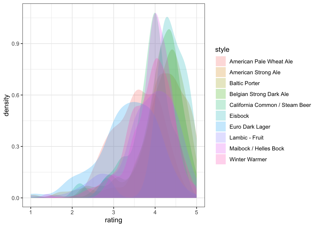
We can take a saved plot (like p) and use scales to change how it is visualized.
p + scale_fill_viridis_d()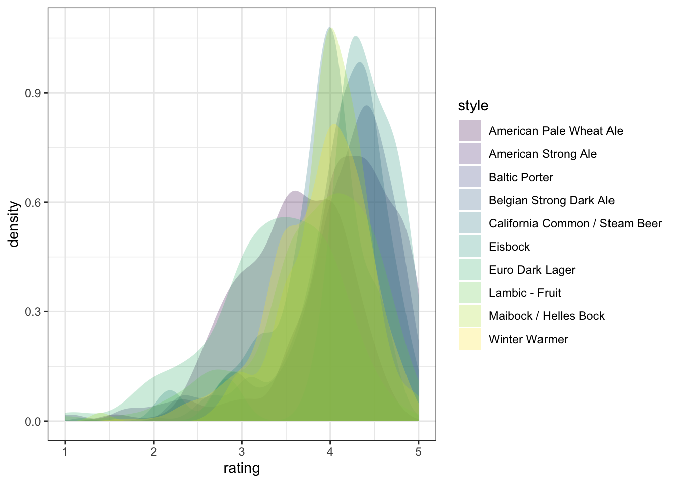
ggplot2 has a broad range of built-in options for scales, but there are many others available in add-on packages that build on top of it. You can also build your own scales using the scale_*_manual() functions, in which you give a vector of the same length as your mapped aesthetic variable in order to set up the visual assignment. That sounds jargon-y, so here is an example:
# We'll pick 14 random colors from the colors R knows about
random_colors <- print(colors()[sample(x = 1:length(colors()), size = 10)])
## [1] "gray43" "bisque2" "grey19" "slateblue3" "royalblue4"
## [6] "turquoise1" "purple2" "navajowhite" "turquoise3" "sandybrown"p +
scale_fill_manual(values = random_colors)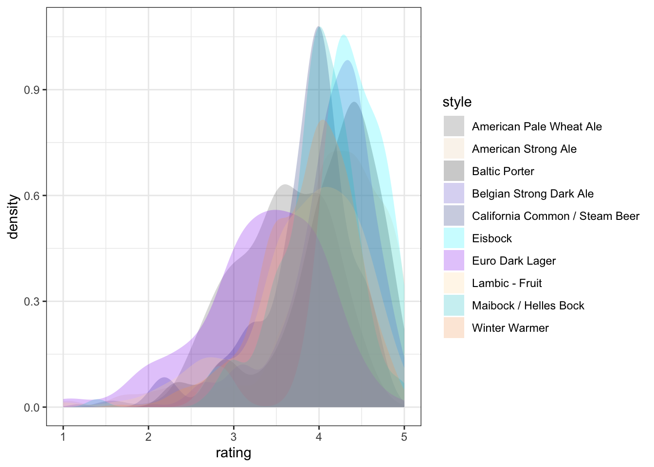
4.4.3 Finally, facet_*()
The last powerful tool I want to show off is the ability of ggplot2 to make whatEdward Tufte called “small multiples”: breaking out the data into multiple, identical plots by some categorical classifier in order to show trends more effectively.
So far we’ve seen how to visualize ratings in our beer data by ABV and by style. We could combine these in one plot by assigning ABV to one aesthetic, style to another, and so on. But our plots might get messy. Instead, let’s see how we can break out, for example, different ABVs into different, “small multiple” facet plots to get a look at trends in liking.
A plausible sensory hypothesis is that the palate variable in particular will change by ABV. So we are going to take a couple steps here:
- We will use
mutate()to splitabvinto low, medium, and high (using tertile splits) - We will plot the relationship of
palateto ABV as a density plot - We will then look at this as a single plot vs a facetted plot
p <-
  beer_data %>%
  # Step 1: make abv tertiles
  mutate(abv_tertile = as.factor(ntile(abv, 3))) %>%
  # Step 2: plot
  ggplot(aes(x = palate, group = abv_tertile)) +
  geom_density(aes(fill = abv_tertile),
              alpha = 1/4, color = NA, adjust = 3) +
  theme_classic()

# Unfacetted plot
p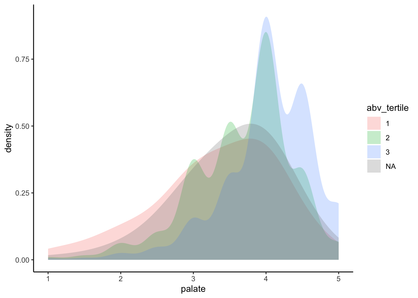
It looks like the expected trend is present, but it’s a bit hard to see. Let’s see what happens if we break this out into “facets”:
p +
  facet_wrap(~abv_tertile, nrow = 4) +
  theme(legend.position = "none")
<img src=“4-dataviz_files/figure-html/now we split the plot into 3”small multiples” with facet_wrap()-1.png” width=“672” />
By splitting into facets we can see that there is much more density towards the higher palate ratings for the higher abv tertiles. This may help explain the positive relationship between abv and rating in the overall dataset: the consumers in this sample clearly appreciate the mouthfeel associated with higher alcohol contents.
4.5 Some further reading
This has been a lightning tour of ggplot2 as preparatory material for our core material on text analysis; it barely scratches the surface. If you’re interested in learning more, I recommend taking a look at the following sources:
- Kieran Healy’s “Data Visualization: a Practical Introduction”.
- The plotting section of R for Data Science.
- Hadley Wickham’s core reference textbook on ggplot2.